McDonald’s is a well-known food joint in the world, and you can never find someone from the 90s who has not tasted it with their friends and family.
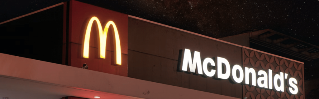
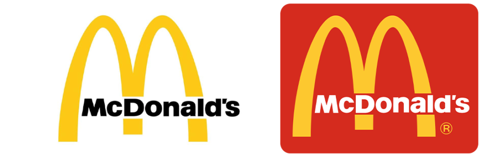
Whenever we see a big M filled in with yellow, we get McDonald’s in mind, and indeed, it’s one of the best eateries for kids. But wait, do you know the history of the McDonald’s logo?
How do the owners or the logo designers come up with the idea of using a textual logo design for the brand instead of any visual art?
It could be a great example of a combination logo, and if you’re a logo designer planning to learn about the logo design trends and their types, then this blog is the best thing to read for you.
We have also covered the Starbucks logo history, Walmart, Pepsi logo design, and a lot more leading brands to make the designing experience more fulfilling and fun-filled.
McDonald’s is one of the most recognised brands, and indeed, there are now more than 43,000 franchises all over the world with a huge number of sales & crazy food lovers.
They are always working on the branding and coming up with great advertisements that make the McDonald’s logo more versatile, as they connect with the emotions of the customers.
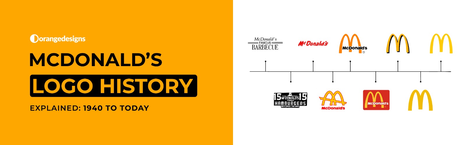
McDonald’s Logo History – A Quick Overview of The Big Gold M
Starting from the initial, McDonald’s is now a well-known brand, and Patrick’s son, Maurice, and Dick have revamped the Airdome and relocated themselves to San Bernardino, California.
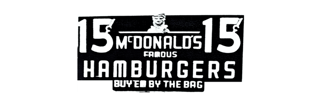
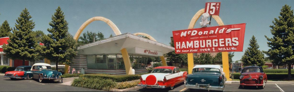
The drive-thru, which we are great fans of today, was called McDonald’s Bar-B-Que – Que means the line. And indeed, if we look into the menu, then there were forty barbecued options available for the customers to choose from.. So, you can see how diversified the McDonald’s logo history is, and indeed, it became one of the most famous brands in the mid-90s.
Back in 1948, the “McDonald’s famous hamburger” was introduced with a juicy chicken patty that became the all-time favourite of kids and adults both. They also serve it with drinks like milkshakes, apple pie, fries, or soft drinks of your choice.

McDonald’s Famous Hamburgers – McDonalds Logo Evolution
As we have told you before, the famous McDonald’s logo history of the yellow M, back in 1948, it became a famous hamburger joint, and the logo was even updated to reflect the literal meaning to the customers.
The new McDonald’s logo showed the similarities in the structuring whereas, it has three words stacked vertically with the famous smaller typeset and being positioned in the middle. Moreover, the McDonald’s logo had a new font that would be so fun, and less formal.
As you can see in the attached image, the McDonald’s logo is coming up with parallel lines that are surrounded by the middle word.
McDonalds Logo History – A Detailed Discussion
Now let’s start discussing the McDonald’s logo history in detail, and we assume that you’re going to enjoy reading it all with us:
- The Speedee McDonald’s Symbol – 1940
The first logo of McDonald’s features a chef character named Speedee, symbolizing the quick service, and the hamburger-shaped head that was running successfully within the time frame of 1940 to 1948.
- Speedy Service System – 1948 til 1953
The Speedee service system, indeed the McDonald’s logo, was updated to emphasize the efficiency and speed with the bright colors and simple design, making the McDonald’s outlets more compelling and attractive the other brands like Mr Burger.
- The Golden Arches – 1953 McDonald’s Logo
Next, we have the iconic golden arches that were introduced in the late 1953, showing the letter M for McDonald’s symbol backed with a golden color representing happiness.

- Stylized M – 1961
After the old times, the graphic designer Jum Schindler was hired to transform the McDonald’s logo with the famous M logo, merging it with cohesive symbols that were screaming “McDonald’s” and all the kids were crazy after it.

- Simplified M – 1968 to 1975
Next, we have the simplified version of the McDonald’s logo that was refined into a sleek, singular “M” shape logo that is well recognised today by the 90’s kid with a red color on the base to dominate the M in the eatery market.
- McDonald’s Logo Evolution to “I’m Lovin’ ‘it” – 2003
The McDonald’s logo was then updated with a sleeker design that focuses more on the sleeker design and the brand’s core commitment to great aesthetics, and introduces the popular slogan that all the kids are now saying when they see the big golden M.

- Modern Golden Arches – 2006
Lastly, the McDonald’s logo focuses more on the Golden Arches and shifts towards universal brand recognition. This is the last modernized McDonald’s logo design that we are still seeing, and let’s see when they are going to bring any change to it.

Wrapping Up – McDonald’s Logo Design History
And we are done for the day. We hope you enjoyed reading about the McDonald’s logo history and how the big golden M has become a symbol of quality, convenience, and affordability for the customers. The logo has evolved to reflect the message of growth, and quick adaptation that reflects the designing trends, and commitment to the visual transformation.