The Walmart logo history is well-explained, and indeed, it’s a well-known retail shop that is operating as a chain of hypermarkets, discount department stores, and grocery stores. But do you know the entire dynamics behind the Walmart logo history?
According to Ecommerce bonsai, Walmart’s key statistics, which include serving the 230 million customers weekly that are operating 5,993 international stores, have the most stores in the United States in Texas. In the United States, Walmart’s e-commerce sales saw a 9% increase across the channels
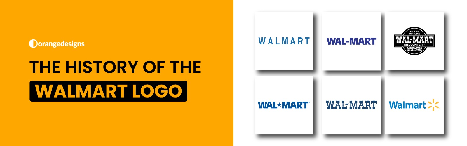
The design for the Walmart logo holds a great history, and we’re going to discuss it all with you. We will discuss the Walmart logo evolution, and everything, including the history behind the old Walmart logo over the years.
You can hire our designer for the design of your business logos, and if you plan to own a mart and run it completely, then you will have to connect with our logo designers for the logo design.
Also Read: What is a Logo, and Why Does it Matter for Businesses
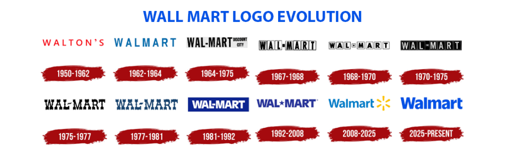
Walmart Logo Evolution – Year by Year Contribution
In this section, we will explain about the Walmart logos over the years:
- 1950 – 1962 – The Genesis of Walmart Logo
The logo of Walmart was first launched in 1950, and it was rendered in scarlet red capital letters with the brand name appearing to be really impressive and simple with a sans-serif typeface.

- 1962 – The Original Wordmark
The Walmart logos over the years have transitioned completely, a fresh blue, all‑caps sans‑serif logo—clean, simple, and trustworthy when Walmart began in Rogers, Arkansas. It was initially the old Walmart logo design that was introduced to the public.

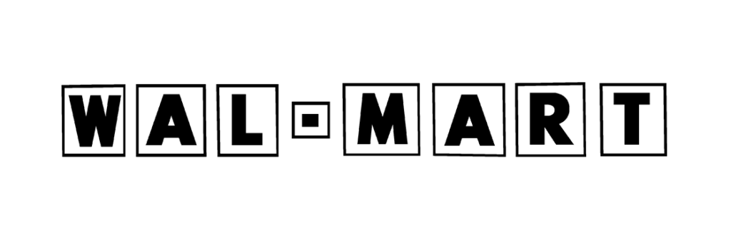
- 1964–1981 – Frontier, Hyphen & “Discount City”
The Walmart company also adopted the black “Walmart” with a hyphen, and indeed a western-style frontier font, and most of the time phrases like “discount city” that reflect the American rural origins and low-price ethos.
- 1981–1992 – Bold Sans‑Serif in Brown (and Later Blue)
The third phase of the Walmart logo design is a bold, blocky sans-serif wordmark that appears to be brown and later navy blue, signaling Walmart’s evolution from the rural retailer to the nationwide chain.
Apart from the hyphen, the company also makes it sound like “Wal-Mart,” which was created as an easy-to-recognise wordmark. The entire response to this newly launched logo iterated a lot, and it was a positive iteration. By the late 1980s, Walmart’s logo became a popular brand logo, and it was displayed on all entire merchandise.

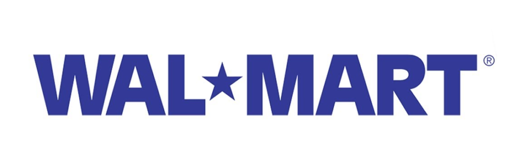
- 1992–2008 – Introducing the Star
The hyphen was replaced with a Walmart logo design with a five-point between “Wal” and “Mart” that retains blue, which shows modernized and national identity.
- 2008–2025 – The Yellow “Spark”
Next, we have the 2008 to 2005 range, the star gave way to a six-point yellow spark at the end of the lower case, “Walmart,” and on the lighter shade of the blue that sparks reflects innovation, optimism, and new initiatives.

- 2025–Present – Fresh “True Blue” & Refined Spark
Lastly, Walmart’s first major refresh in 17+ years, which includes a bolder, custom-crafted True Blue wordmark that is inspired by Sam Walton’s trucker hat with thicker yellow spark rays with smoother letterforms, and enhanced with digital adaptability.

The History of Walmart Logo
Based on our research, Sam Walton first started a five-and-dime store in downtown Bentonville, Arkansas, back in 1950, and later on, he changed it to Walmart back in 1952, which had a simple logo that we have already shared within the blog.
During the initial phase, Walmart used to focus on the rural areas to stop retailers from facing any issues in getting the products; however, in 1990, the company has also gained great prominence as the biggest retailer in the United States, and almost all the residents in the USA are purchasing from Walmart sites.
How to Hire a Logo Designer for Walmart Logo Design?
From the old Walmart logo to the recent one, a well-experienced logo designer will know the history behind the Walmart logo, and we are going to explain it all with you:
- Know your Requirements —
The first step to hiring a Walmart logo designer is to always keep an eye on the logo designers who have expertise with logo designing and have done designs for similar brands.
- Shortlist a Logo Designer —
The second step is to shortlist a logo designer who has compelling ideas and has all the basic information related to logo design.
You can shortlist the logo designer for the Walmart logo who has prior experience and a strong portfolio.
- Place them an Offer
After assessing them and taking the interview with the Walmart logo design expert, you will have to make them an offer and wait for them to accept or reject the offer.
Walmart Logo History — Holding A Complete Story Behind
And we are done for the day. We hope you all know about the Walmart logo evolution and how it transitioned from the initial stage to the final stage, where it stands now.
Walmart is a leading brand, and if you are planning to start your career in logo designing, then you should know about Walmart, Coke, Starbucks, and many more to get an idea about the design process behind each one of them.
FAQs
Yes, we do offer logo design services, and if you wish to get a logo similar to the Walmart logo, then you may let us know.
Sam Walton’s heirs own the 50% share of the Walmart store.
The Walmart logo evolution holds a different story, like “sparklets” that symbolise the company’s core values and principles, which easily contributed to the success ratio.