Do you know the history behind the target logo? If not, then we are here to make you learn about the target logo’s meaning and the historical timeline for a detailed overview.
Target is a leading brand within the United States, and it’s one of the largest retailers for a good reason: that is, offering customers cost-effective pricing and quality products that make the company proud, and customers would love to purchase them themselves.
Target logo meaning loyalty, the company is known for making affordable and high-quality products available for the customers to purchase, and they are using exceptional branding and marketing strategies that make the designs more attractive in the rapidly growing digital world.
In this blog, we will teach you to learn about Target’s logo history and how many changes it has undergone to come up with the modernized logo design that we are seeing these days.
Fun Fact – Many retailers and shopkeepers say that, Target bullseye logo is one of the most recognised logos and people have memorised it for a longer time; even now!
Target’s logo has evolved more than 5 times since its initial time, and we are here to make you learn about the transition.
Are you excited to explore it all with us? Let’s get started then.
Interesting Facts About Target Logo
If you’re a die-hard fan of Target’s product, then this section is going to sound interesting and attractive to you.
- In general, merchandise retail stores have around 50 outlets across the United States and the District of Columbia. Sounds interesting?
- The Target logo workforce includes 350,000 members who are working day and night to make the brand what it is today, a trustworthy household brand.
- More than 75% of the United States people are now using the Target brand and even visiting the outlets that are 10 miles away from their physical locations.
- The corporation also owns Shipt and Roundel.
- The Target brand slogan says that “expect more, pay less” and it was first introduced in the year 1994.
You can also read, Walmart Logo Design and History.
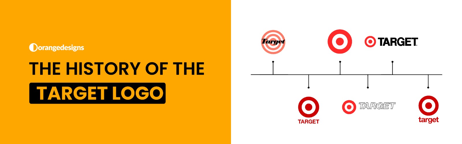
Target Logo Evolution – How The Logo Has Transformed Itself
In this section, we are going to learn about the target logo’s evolution over the years, and we assume that you’re going to enjoy reading it all with us:
Original Target Logo History – 1962
The original and first Target logo was designed in 1962, and it stayed with the company for like a good six years. Later on, the bullseye Target logo featured a stylised target logo design with three red circles and a white space between them.
The brand’s name and purpose were well explained within the logos. Moreover, the company name “Target” was also written in bold and black color in serif font across the logos.

Target Logo Evolution – 1962 to 1968
The target logo underwent its first change, and it was a more simplified logo design by removing the two outer rings and placing the company name on the white background for a better design and visibility.

Target Logo Bullseye Symbol – 1968 to 1972
The Target logo history holds a lot of creative layers, and one of them was featuring a standalone bullseye symbol without the company name in 1972.
If you think we are missing something, then have a closer look at the Target logo.

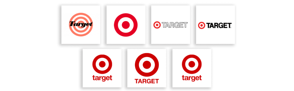
Target Logo Redefined — 1975 to 2004
The Target logo was reimagined in the 1970s with the shifting of the iconic white-red rondel to the left of the name, making it more focused.
The logo designer enlarged the text, with the use of bright red color, and indeed bullseye dominated the logo design.
Target Logo Compelling Huge Bullseye — 2004 to 2018
Next, in 2004, the Target logo underwent great changes in design, like focusing more on the monochromatic color with the huge bullseye and a small word mark, making the logo look minimalist.
Audiences were impressed to see a cleaner and less cluttered version of the logo.

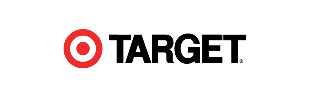
Target Logo Modernized Look — 2018 to Today
Lastly, we would say that the Target logo was redesigned in 2018, where all the all-caps letters were replaced with lowercase letters that we can see today.

Target Logo Design Elements
- The red color represents power and passion. Whereas white shows elegance with style.
- The bullseye symbol is a direct reference to the brand name, “Target”, representing precision and focus.
- The font used under the logo showcases clean and modernized typography.
Stewart K. Widdess led the design team in 1962, which designed the initial Target logo.
Stewart K. Widdess and his team at Dayton’s did the early designing in the 1960s.
It’s purely red and white.