Do you know the meaning of the Starbucks logo? The Starbucks logo history?
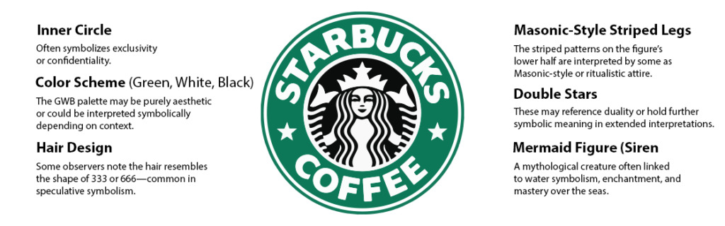
Suppose you went to a grocery store and out of nowhere you rushed to the green colored shop having a logo, Mermaid and Siren, and we all know what it’s all about — Starbucks (the coffee masters).
In the initial phase, the original Starbucks logo was a detailed, brown depiction of the siren inspired by the 16th-century Norse woodcut, and it also had a word mark and stars around it.
However, with time, the Starbucks logo evolution took place, making the recent iteration from a simple one to a more modernized design in 2011, removing the word mark and stars and even the outer liners, focusing more on the siren symbol only.
In this blog, we will walk you through the Starbucks logo evolution, and we hope that you are going to enjoy reading it with us.
What is the significance behind Starbucks’ original logo?
Terry Heckler, a well-known graphic designer, was inspired by Seattle’s location and came up with the idea of designing the Starbucks logo, making it a legacy..
Starbucks’ siren was designed to symbolize how the figure would attract the coffee lovers who love to shop, work in offices, and even take classes while grabbing a cup of Starbucks coffee.
Walmart Logo Evolution — You may also read this blog.
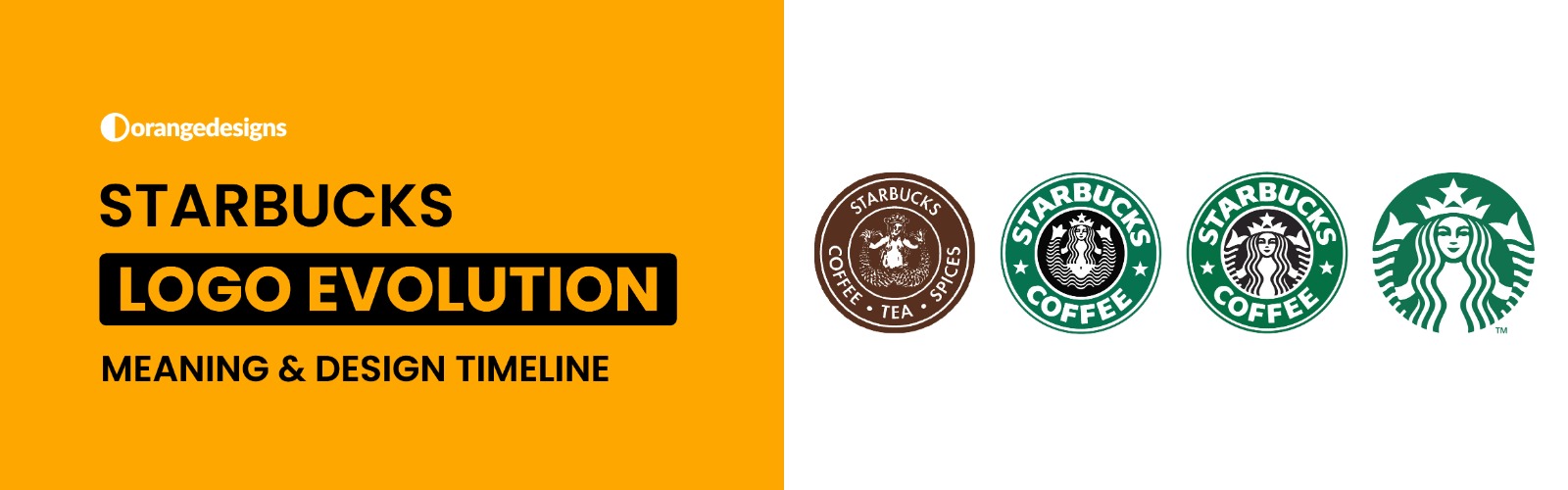
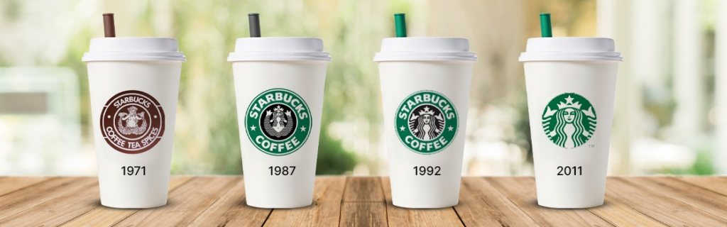
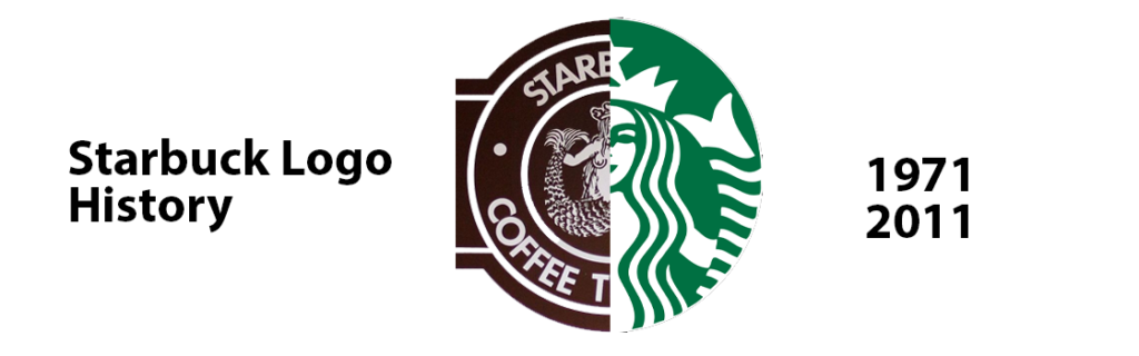
Starbucks Logo Evolution — 1971 to 2011
The Starbucks original logo has transitioned a lot from 1971 to 2011, and if you wish to hire our logo designer, who is professional with their work and knows all the tactics behind designing, then Orange Designs is the best place for you.
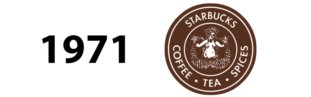
- The Siren — 1971 Starbucks Original Logo
The Starbucks original logo features a siren, a mythical creature from Ancient Greek mythology, that is surrounded by some words like Coffee and Tea, which you can even see in the logo below.
The Siren was actually inspired by the 16th century woodcut. So if you are from the 90’s and a die heart coffee lover then you would remember the old Starbucks logo design.
Lastly, the old Starbucks logo was a black and white one with no such colors added to it.
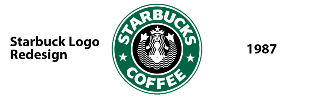
- The Green Siren — 1987 Original Starbucks Logo
Back in 1987, we saw complete significance in the Starbucks logo design when Howard Schultz joined the Starbucks team and used his creativity to evolutionarily transform the Starbucks logo’s old design.
The new logo features a green colored, more modernized siren with flowing hair and a split tail, all surrounded by the Starbucks name, replacing coffee and tea with “coffee” and two vibrant white stars.
A better outline and a more subtle design made the old Starbucks logo look more stylish and captivating. A logo design is really important for businesses as it’s the one that captures the attention of the audience, and indeed, with optimal color selection, you grab the attention.
- The Siren Exposure — 1992 Starbucks Logo Design
Let’s jump to 1992, when the Starbucks original logo was updated with the siren’s breast becoming more vibrant.
It changed the way the logo was made, making it more modern according to the current industry trends.
The core design elements for the siren remained the but, but this time, more emphasis was on the enlargement of the siren’s breasts, and you can see it later in the blog too!
According to Starbucks’ official, we made stock options a reality for all eligible employees in 1991, but it wasn’t until June 26, 1992, that we made our initial public offering (IPO).
We weren’t exactly a new company by then – after all, we’d been around for 21 years – but seeing “SBUX” listed on Nasdaq was a huge step.
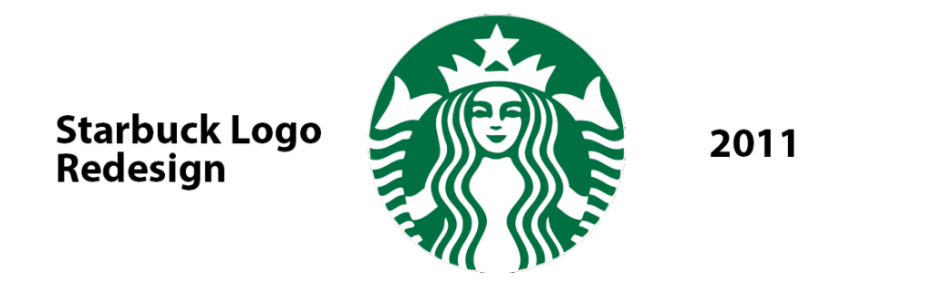
- Modernized Starbucks Logo — 2011 till Now
Lastly, we have the most modernized Starbucks logo design that has officially removed the initials, Starbucks Coffee, from the logo design, sticking to the siren only.
The change was made to reflect the company’s growing brand portfolio and the demand for Starbucks coffee worldwide.
Youngsters are seen more often to have Starbucks coffee while travelling, studying or even planning meetups with friends.
The Starbucks logo evolution reflects the company’s growth and quick transformation due to the massive change that was observed during the past decade..
Have you tried Starbucks coffee yet?
Starbucks coffee has officially rebranded itself massively from 1971 to 2011. The massive expansion goes beyond coffee but brings a feeling of relief for coffee lovers.
The evolution of the Starbucks logo represents the company’s growth and transformation over the years, while maintaining the iconic logo styles and being recognized worldwide, not just in the USA but other countries.
FAQs
They started by dropping the “coffee and tea” words from the logo and showed a clear intention to offer a wider range of products.
Starbucks coffee started to gain popularity in the 90s, with massive growth in the latter half of the decade.
Brian Niccol is the current CEO of Legendary Starbucks Coffee.