Suppose you went grocery shopping and saw a blue and black logo being imprinted on a bottle. You instantly grabbed it and put it in your cart — you know what it is, it’s Pepsi!
Pepsi has been one of the most successful and fastest-growing beverages, and people worldwide are passionate about it.
However, the Pepsi logo’s history is quite different, and not everyone knows about it. The Pepsi logo has evolved a lot since its creation, shifting from a simple script logo to the iconic globe symbol design, and coming up with various redesigns.
In this blog, we are going to learn about the Pepsi logo evolution, and we hope that all of you are going to enjoy exploring and reading it with us.
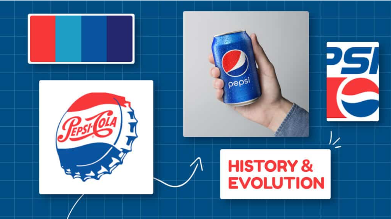
Pepsi Logo History
There is a wide history behind the Pepsi logo, as it was born in 1893, and it was initially created by Caleb Bradham for his drug store in North Carolina. It was made with water, sugar, and caramel, along with nutmeg, lemon oil, and kola nuts that made up the drink, Pepsi. However, you know what?
The Pepsi logo evolution has transformed itself from a single logo to a more modernized one that we are going to discuss today.
Pepsi is now valued at over $11 billion. Indeed, PepsiCo generated more than $70 billion in net revenue in 2020.
It was just the initial demonstration about the brand Pepsi, but now we are going to learn about the Pepsi logo evolution for you:
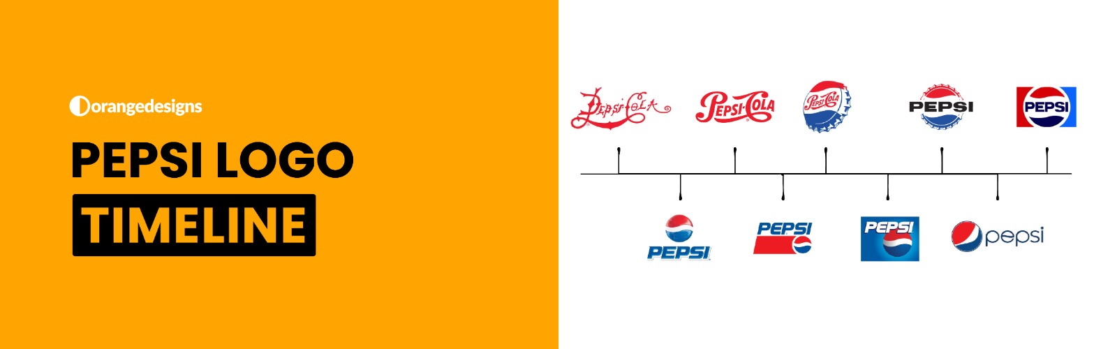
Pepsi Logo Over The Years
The Pepsi logo has transitioned a lot from a really drastic logo design in order to compete well with the competitors, and indeed, the style has shifted over time, and it’s a classic addition to the Pepsi family.
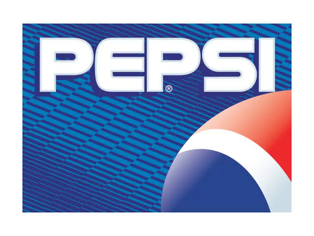
But you know, the Pepsi logo design started from red, whereas now it’s combined with an amazing logo color combination of red, blue, and black.
Also Read: The Story Behind the Levi’s Logo Design History
- Pepsi Logo Evolution (1889-1951)
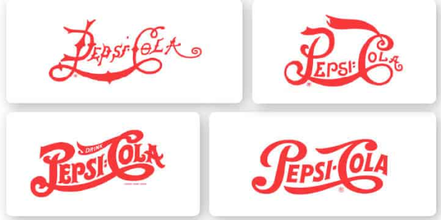
The original Pepsi logo was initially blue in serif, and it was known as Brad’s Drink, not Pepsi. The old Pepsi logo evolution was observed in 1893, with bold letters.
Whereas, in 1899, the Pepsi logo over the years has changed into script reassembling handwriting, and indeed, the logo was changed to Pepsi Cola.
The Pepsi logo evolved in 1905, and the logo underwent a great change, featuring a more efficient and streamlined script with cleaner lines and a more professional look and feel.
Lastly, in 1951, the red inscription was refined, and a thick Drink icon was added above the C in the Pepsi logo, bringing a sense of movement and showing progress to the die-hard lovers of Pepsi Cola.
- Pepsi Logo History — 1971 to 1996
Now this era was known as modernisation in the Pepsi logo history, as in 1950, the Pepsi logo modernized itself with a bottle cap, retaining the old look and feel.
Whereas, in 1962, the brand initially showed a sans-serif typeface for the word mark, overriding the script style completely.
Lastly, the Pepsi logo was introduced, featuring a circular design, adding colors like red and blue with the white waves symbol, making it more iconic.
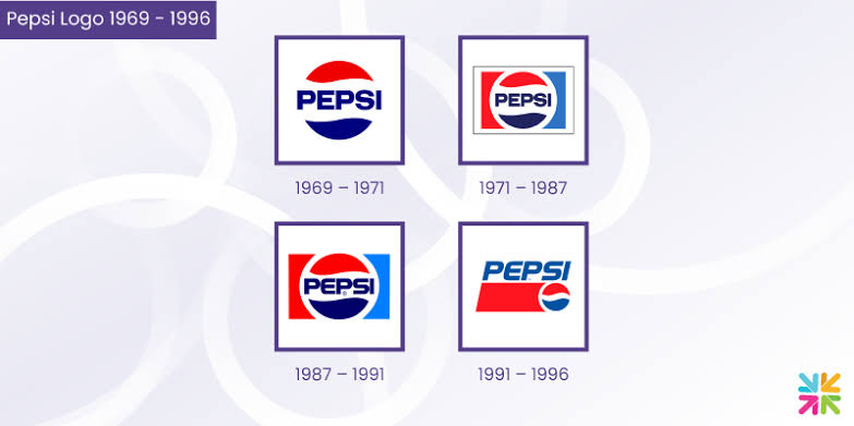
- Pepsi Logo Over The Years — 1971 to 1996
Next, we have the Pepsi logo evolution, bringing in innovation. Back in 1971, the logo featured a circle with a thick white outline, with half red and half blue sides of the logo.
However, coming to 1987, the frame was changed and removed to make it look more stylish, and indeed now it became known worldwide by the customers.

Lastly, falling to 1996, the word mark logo stretched across the top of the bold red bar, making Pepsi a global symbol for the frizz drink lovers.
- Pepsi Logo Minimalist — 1996 to 2008
As we are coming near the recent year, in 1996, the 3D effect was introduced into the Pepsi logo history, creating a better picture and sense.
Moreover, the globe was further refined into a better image in 2003, with more shading to enhance its three-dimensional effects.
Lastly, in that era, 2008, the Pepsi logo evolution was seen as a redesigned image, with an asymmetrical outline and lines, as you can see in the image below.
- Pepsi Logo Finale — 2008 to Present
Lastly, in 2008, the logo was simplified with a lowercase font, giving it a more professional look. Moreover, 2023 was the year when the last changes were made to the Pepsi logo, featuring vibrant colors and symbols.
Wrapping Up — Pepsi Logo History
The new and most updated version of the Pepsi logo features a brand heritage, incorporating logo colors blended with better layouts, bringing a sense of modernization to the world of logo design.
If you think we have missed anything within the blog related to Pepsi logo history discussion, then, feel free to share your thoughts in the comments section. Happy Reading!!