The logo design that you see almost everywhere, when choosing any brand, speaks a lot about the offerings, but there is a complete journey behind it. The journey of selecting the right color palette and avoiding mistakes leads to delivering the best version of the logo.
Perhaps there are certain logo mistakes that designers make, which they correct after going through a detailed session of conflict.
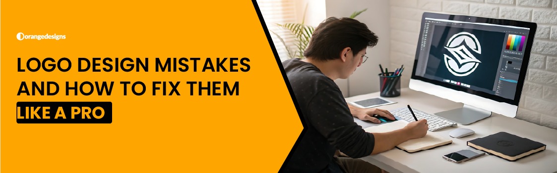
Orange Designs LLC is proud to offer logo design services offered by professional logo designers who possess years of experience in designing and delivering the best version of the logo design; however, they are not liable for performing the best strategies and coming up with a great version.
A logo is one of the finest forms of art, and it’s actually really important for any brand because it showcases the brand’s value to the customers and makes them feel connected to you.
But if you are a newbie in logo designing, and want to save up your time by learning about the common logo design mistakes and the ways through which you can fix each one of them.
Let’s get into it.
Common Logo Design Mistakes To Avoid Beforehand
In this section, we are going to pen down the common logo design mistakes that will make you stand out from the crowd. You can even save up a lot of time to avoid any hassle. So, are you excited to explore it with us?
- Classifying The Colors And Shades Into The Logo
The first and most common logo design mistake that we have seen, particularly, is that logo colors don’t stand with each other because the colors have different saturation levels and hues, whereas, for a professional logo designer, they must make a pure tone that goes perfectly with each other.
So, the best way out is to design a logo without thinking of the colors to be used within the logo. Professional logo designers uncover the biggest problems by creating a logo without thinking of the colors, and once it’s finalized, they add colors to the logo.
- Using Colors For A Logo That Don’t Go With The Brand
Suppose we all know that, Orange Design logo has colors like red or black; however, the website is orange, white, and black. Then, will the logo look similar to your brand?
Perhaps a logo designer should keep the brand colors in mind and create a logo that reflects the brand’s colors. Choose colors that are important to your brand, and if you think mismatching your logo with the brand will look good, then, the answer is clearly NO.
- Using Too Many Fonts
The brand logo shouldn’t have a lot of fonts because it will feel inconsistent. Whereas a professional logo designer is liable for adding only one to two fonts within the logo design that perfectly fit the brand. The font should carry a message that compels well with the brand’s persona, vision, and mission.
- Adding Too Many Colors
Just like fonts, if you add too many colors in the brand logo, then, eventually, this will be considered as one of the biggest logo design mistakes; however, you can avoid this mistake by using just one primary and secondary color that goes with your brand colors. You will have to choose the right logo color after reading some of the guides and going through professional logo designers’ dashboards.
- Using The Wrong Logo Elements
The fifth most common logo design mistake that we have seen mostly in the brand’s logo is that logo designers never focus on the elements being used within the logo; perhaps, the elements play a great role in making the logo look good and alluring.
It’s important for the logo designers to stop using a lot of elements or wrong containers within the logo that make it absurd for the target audience to view and utilize.
Funny Logo Design Mistakes
If we talk about the funny logo design mistakes, then:
The logo of the London 2012 Olympics was abstract, and when it was viewed from a certain angle, it was interpreted by someone as a swastika, whereas two characters from The Simpsons were engaging in an act that seemed awful.
The other most funny logo design mistake was back in the 2010s Gap logo redesign that was quickly pulled off after the social media backlash, considering the poor design that was under the heat due to critical design aspects.
Why Do Such Logo Design Mistakes Occur?
The following are the reasons that cause logo design mistakes:
- Poor typography using the incorrect spacing, font, and kerning can make the logo design’s meaning entirely.
- The abstract and unclear design can lead to misinterpretation and make the viewers see unintended symbols that are not ideal.
- The lack of testing makes the companies fail to test their logo designs.
Wrapping Up
And we are done for the day. We tried to cover up and mention almost all types of logo design mistakes that we have seen commonly in various brands’ logo designs. If you hire a professional logo designer, the probability of such a mistake will be less, but not zero, hence, you will have to take care of the logo design mistakes to occur and give a refined version of the brand’s logo.