Suppose you went to a store to get yourself some trendy clothes, and these include denim jeans or shirts, then they range from different brands, local to international.
Many brands are winning the trust of customers by giving them the best quality, and if you have to choose among different brands, then, hands down, you’re going to opt for Levi’s. The Levi’s history for the clothing brand has been a self-explanatory thing, and it cannot be explained in words – it’s an experience and satisfaction.
You would be amazed to know that Levi’s logo has undergone 8 redesigns since its inception, and indeed, the Levi’s logo evolution has been a great history for the customers.
In this blog, we are going to discuss the Levi’s logo history, and we assume that you’re going to enjoy reading it all with us.
Sounds like a plan, no?
According to coolest gadget, Levi’s is a global America brand known for its amazing quality of denim jeans, and it was founded in 185 by the german immigrant Lev Strauss in San Francisco, California and indeed the company has transformed itself a lot from a clothing brand to a patenting design agency that is known for denim pants and the quality bringing in innovation and quality.
This innovation and quality made Levi’s history more phenomenal, like blue jeans that are now a great deal for customers. The company now continues to grow and dominate the industry, offering a wide range of denim styles, and it includes Levi’s 501 Original, which includes skinny, flare, and bootcut jeans.

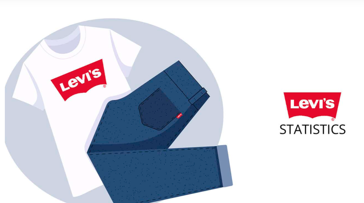
According to Statista, back in 2024, Levi’s net sales reached around 6.35 billion USD, which was double the expectation. Whereas, the company offers a wide range of products under the brand that includes Levi’s, Dockers, dENiZEN, and Signature by Levi Strauss and Co. Levi Strauss & Co. was founded in 1853 by Levi Strauss and is headquartered in San Francisco. The Americas region generated roughly 50% of the company’s total revenue in 2024.
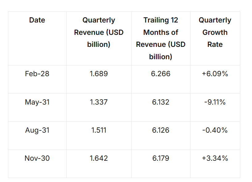
Revenue and growth ratio for the Levi’s brand:
Levi’s Logo Evolution – A Great Lookup Into Levi’s Logo History
Levi’s logo has undergone great changes since its inception, and it comes with 8 redesign approaches from the past 150 years. Here you go with the Levi’s logo history:
Also Read: Logo Design History | Branding and Redesign History
- Levi’s logo history – 1886
The first Levi’s logo is known as the “Two horse pull” or “two horse trademark” that featured two horses in jeans, symbolizing the strength and durability of the brand towards the customers.
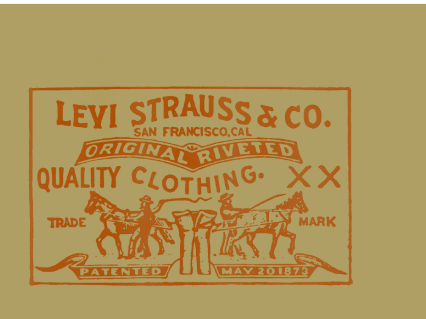
It was initially in the early years, and people were not trusting the brand; however, they kept on improving their services and products.
- Mid 20 Century Levi’s Logo – 1954 to 1969
The first Levi’s logo history introduced the modern logo design with a sleek custom typeface in white, set against the dark red background. The wordmark was tweaked, and the letter E appeared with the diagonal cysts.
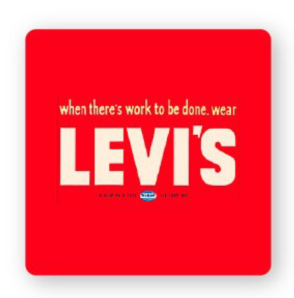
Lastly, the new tagline, like “Vintage Clothing,” was added, and it reinforces a great status as a brand rooted in authenticity and craftsmanship.
Also Read: Starbucks Logo Evolution | Meaning & Design Timeline
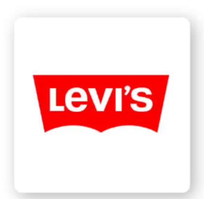
- The Batwing Era – 1969
The third era within the Levi’s logo history was the Batwing Era, which took place in 1969, coming up with the iconic red batwing logo featuring Levi’s in white text against the red background. The design for the Levi’s logo has undergone more tweaks since then, and we will discuss it more now.
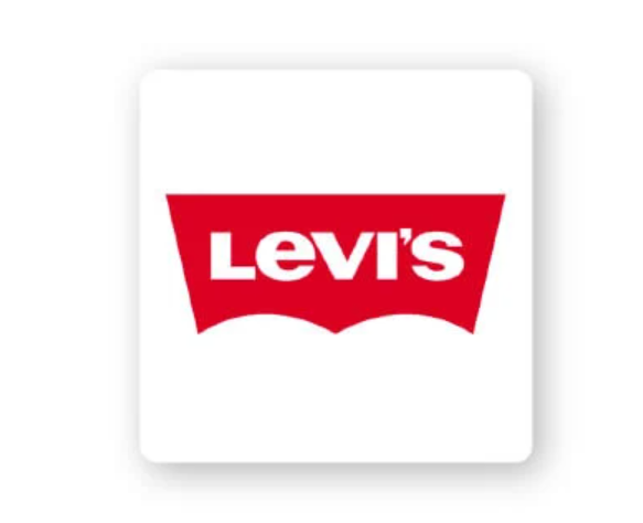
- Levi’s Logo Modernization – 2003
Levi’s logo has transformed itself and the logo itself for a very long time, and the batwing logo has the shape with very few details and a bold, sans-serif font. The Levi’s logo history stays updated to make the logo look more adaptable across different platforms and media.
- Levi’s Logo Finale – 2003
And that’s how we wrap! Levi’s Logo has continued to refine the logo and experiment with subtle modifications to the logo, while maintaining a great digital experience. The brand has also collaborated and brought positive changes to the Levi’s logo, like unique logo variations, like Supreme, Off-White, and Disney.
Key Takeaway – Levi’s Logo Evolution
And we are done. Levi’s logo holds great history, and indeed it has reflected the way the brand has transformed itself, and brought commitment to quality, durability, and style while adapting to all the changes, like understanding the market dynamics, and meeting the cultural trends. You can make things more amazing by learning about the design experience from the logo designers and seeing how they have worked so far since then.