The five-alphabet logo in five different colors seems to be a lifesaver for a lot of people, from corporate to normal life, because they can literally search for anything from that place.
You just never know when a little opportunity is going to turn into a life-changing moment.
In this article, we are going to learn about the history of the Google logo design, when it was designed, who designed it, and for what purpose. We assume that you are going to enjoy reading it all with us.
Let’s get started then…
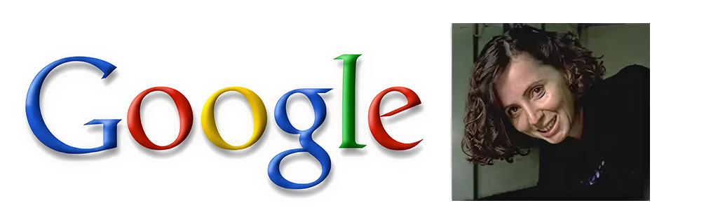
Ruth Kedar – The One Who Designed the Google Logo
Ruth Kedar was the one who designed the Google logo, and indeed, a Stanford instructor, when two of her students asked if she was willing to create a logo for their startup. Whereas, she took their request seriously and the final result was a great logo – Google Logo that meets your trends and expectations.
Hence, the Google logo history is all about the design of the logo with all the best shades and layouts, bringing in the best results that is now known as the game-changer, and used by almost everyone daily.
This was the story behind the Google logo history, and now we are going to discuss the history behind the Google logo.
As per the reports, more than 4.9 billion users recognize the Google logo, and it’s a great place for them to search for anything they want.
Today, we are standing in 2025, and Google is known as the best brand in the world. The logo has changed over the decade to stay relevant and give customers the information they are looking for in a detailed manner.
“A logotype expresses contemporary visual culture, development, and taste. It also communicates a company’s attitude and core activity,” – Veronika Burian, Co-Founder of Type-Together.
But again, the question remains the same: what made Google Logo a successful search engine today? We are going to discuss it all today:
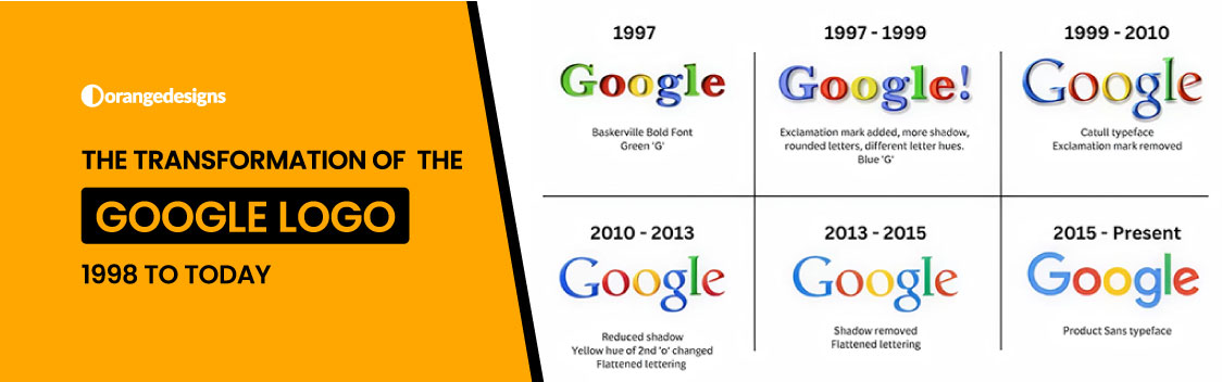
Google Logo History – A Quick Insight
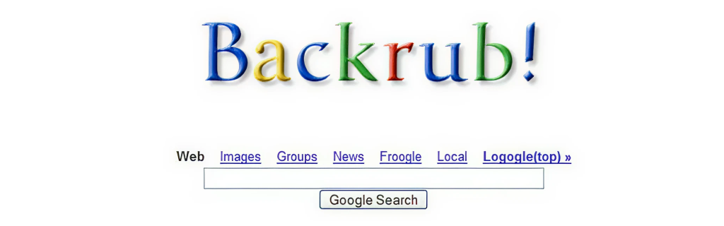
Backrub Google Logo History – you must be thinking, what does the word “Backrub” mean? So basically, Google was initiated with a project called BackRub at Stanford in the year 1996. The Co-Founders, Sergey Brin and Larry Page, wanted to make all the information on the Internet readily available, and indeed, BackRub yesterday was going to be a massive search engine today, GOOGLE.
- The Original Google Logo
The Google Logo history is all about the logo that was a straightforward design, all done by Sergey Brin, who used free graphics programs, and for the retro Wordart vibe, which was very trendy at that time.
The Baskerville Bold typeface and brave, yet playful, logo colors caught the attention of Google’s audience. It was simple, fun, and original!
- First Google Logo Evolution (1997 – 1998)
Back in 1997, Google presented its first logo design with a classic 90s creation, and it came with an exclamation point at the end. Basically, it’s a subtle jab at Yahoo! So, now you get an indication?
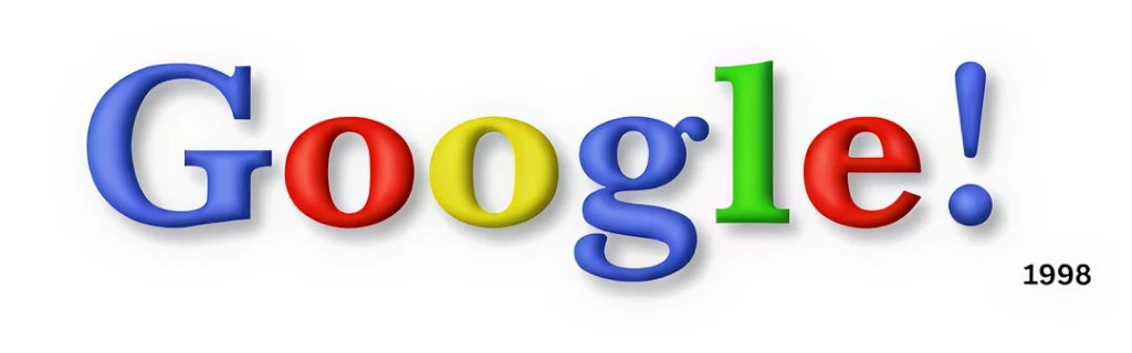
The quick use of a serif font offers a sense of authority and trust to the users. It’s vital for a company that offers users to rely on it, and serif fonts were also in trend in the year 1996.
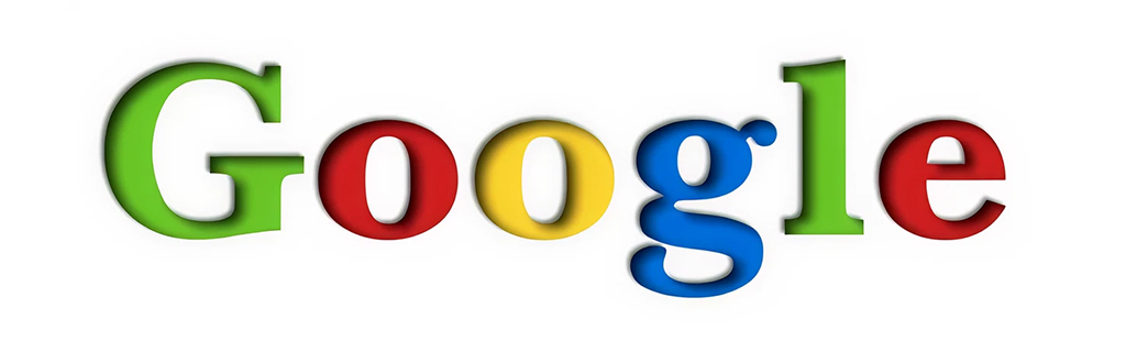
- The Classic Era of Google Logo History (1999 – 2010)
If you are from the 90s, then you must know about the classic era of Google, as it decided to lean further into the playful mood of the logo. And the entire team of Ruth Kedar joined hands to create a colorful Google logo that is now familiar to all people.
Create your own logo today
Hire a professional logo designer today
The new logo basically comprises the typeface, Catfull, and the Catfull font has sharp serifs, an angled axis, and a modernized feature that adds beauty to the logo design.
“We ended up with the primary colors, but instead of having the pattern go in order, we put a secondary color on the L, which brought back the idea that Google doesn’t follow the rules.”
– Ruth Kedar, Logo Designer
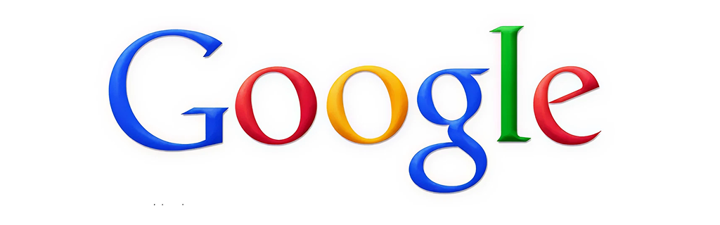
- Future Google Logo History (2010 – 2013)
Fourthly, we have the Google logo that is shedding the startup skin, as the Google logo has grown by 25,000 employees and is being used in over 100 countries. Perhaps Google needed a logo to reflect the transition of the entire logo from one year to another.
As a result, the logo drops a great shadow as it was minimized and all the colors’ sharpness was muted, creating a great and smoother appearance. The modern design actually reflected the stark advancement of the technology.
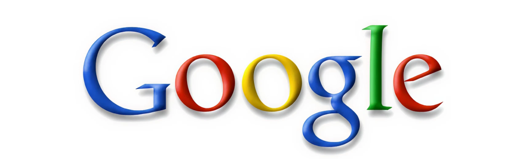
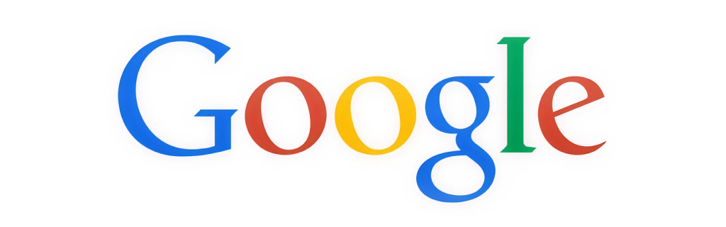
- Google Logo History Timeline (2013 – 2015)
Next, we have the Google logo that comes with a minimal and modern design approach, eliminating the shadow effect and opting for a flatter and simpler design.
It was a great and logical approach by Google as they updated its logo from the fun-filled style to a serious one, which is influential and brings in amazing outcomes.
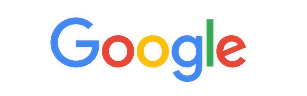
- Google Logo Design Current Format (2015 to Present)
Lastly, we have the recent Google logo design that was designed in 2015, and it was more than just a logo, but a feel, a platform for many where they could search and get all the information literally in seconds.
The recent Google logo represents the complete brand overview and the founding of the parent company, Alphabet Inc.
As per the Google Chief Designer:
“The Google logo always had a simple, friendly, and approachable style. We wanted to retain these qualities by combining the mathematical purity of geometric forms with the childlike simplicity of schoolbook letter printing.”
– Alex Cook, Jonathan Jarvis, and Jonathan Leepull, Chief Designers at Google
Wrapping Up – Google logo history today
And we are done for the day. We hope you enjoyed reading about Google’s logo design history and how it transitioned from the initial days to the final stage. As per reports, the last change was made in 2015; perhaps still, the logo is being utilized and known worldwide for its exceptional searching capabilities. The logo is the fact of the concurrent mission – massively bringing in changes but keeping the spirit alive, allowing users to search and get all the information in one click. Happy Reading…
Ruth Kedar designed Google’s initial logo back in 1999.
The four colors involved in the Google logo, blue, red, yellow, and green.
The primary one was Google Sans; however, they have been using a variety of logos for designing since its inception.